Eps 2341: ux design on 'chunking' information grouped into familiar, manageable units is more easily understood and recalled. Visual example fishing gear
— The too lazy to register an account podcast
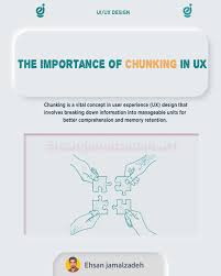
The podcast discusses the concept of "chunking" information in UX design, which involves grouping information into familiar and manageable units to enhance understanding and recall. The host demonstrates this concept with a visual example of organizing fishing gear, illustrating how chunking can make information more digestible for users.
| Seed data: | Link 1 |
|---|---|
| Host image: | StyleGAN neural net |
| Content creation: | GPT-3.5, |
Host

Ellen Ellis
Podcast Content
To understand the concept of chunking in UX design, let's take a visual example of fishing gear. Imagine you are a beginner angler looking to buy your first fishing rod. As you walk into a fishing store, you are immediately overwhelmed by the wide variety of rods, reels, lures, lines, and other gear on display. Without any prior knowledge or experience, all this information may seem daunting and confusing.
Now, let's apply the concept of chunking to this scenario. Instead of presenting all the fishing gear at once, the store organizes the products into different sections based on their use. For example, there is a section for rods, another for reels, and another for lures. Each section is further divided into subcategories, such as freshwater rods, saltwater rods, spinning reels, casting reels, topwater lures, soft plastic lures, etc.
By chunking the information into familiar categories and subcategories, the store makes it easier for you to understand and navigate through the different types of fishing gear. This organization helps you focus on one category at a time, reducing cognitive overload and making it easier for you to compare and select the right products for your needs.
Moreover, chunking also helps with the recall of information. When you are ready to make a purchase, you can easily remember where each type of gear is located in the store and quickly find what you need. This mental organization makes the shopping experience more efficient and enjoyable, increasing the likelihood of you becoming a repeat customer.
In the digital world, the same principle applies to UX design. When designing a website or app, UX designers can use chunking techniques to present information in a logical and intuitive way. For instance, breaking down a complex registration form into smaller, more digestible steps can help users complete the process with less frustration and error.
Another example is organizing product categories on an e-commerce site into clear and distinct sections, making it easier for users to browse and find what they are looking for. By chunking information into manageable units, designers can improve the overall user experience and increase user engagement and satisfaction.
In conclusion, the concept of chunking in UX design is a powerful tool for enhancing user comprehension and retention. By breaking down information into familiar, manageable units, designers can make digital products more user-friendly and intuitive. Whether it's shopping for fishing gear or navigating a website, the benefits of chunking are clear - it leads to a more enjoyable and efficient user experience.